Data Studio with Google Analytics
Visualisation of the Google Analytics data from Pareto in Google Data Studio
Google Data Studio is a powerful tool for creating visual reports from a variety of data sources. In this tutorial, a Google Analytics account integrated with Pareto will be used as the data source. Browse to datastudio.google.com to get started.
Add Google Analytics Data Source
Add the Google Analytics property as a data source
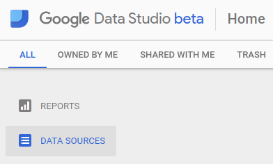
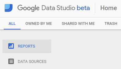
The Home screen of Google Data Studio provides a list of Reports and Data Sources. The Google Analytics property must first be added as a Data Source before it can be included in a report.
Select the Data Sources View by clicking on Data Sources from the left menu.
Add a new Data Source by clicking on the + button at the bottom-right of the screen.

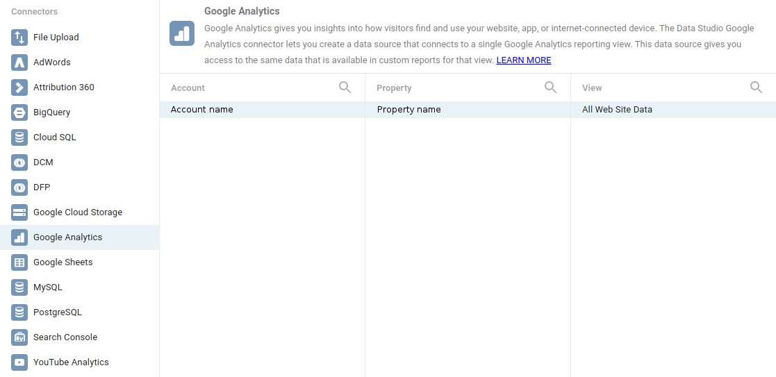
Select Connector
From the list of Connectors at left, select Google Analytics then select the corresponding Account and Property and the All Web Site Data View.
Click on the Connect button at the top-right of the screen.

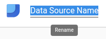
The Data Source now connected, it can be renamed to represent the corresponding physical space, for instance. Click on the title at top left and edit to rename. The Google Analytics Data Source is now ready.
Create Report from Data Source
Create a new Report from the Google Analytics data
From the Data Studio home screen (which can always be reached by clicking the logo icon at top-left), it is now possible to create a Report.
Select the Reports View by clicking on Reports from the left menu.
Create a new Report by clicking on the + button at the bottom-right of the screen.
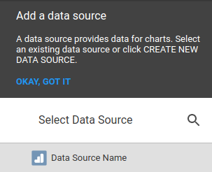
A blank Report should be visible with an option to select a Data Source at right. Select the Google Analytics Data Source by its name.
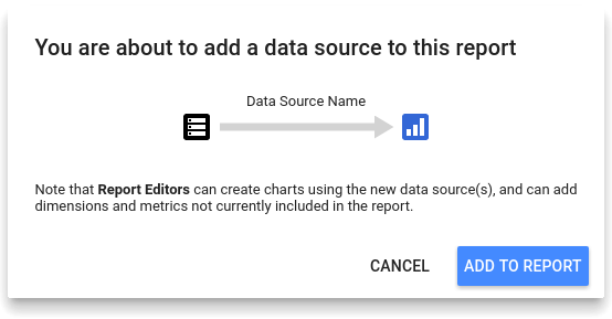
When prompted, confirm the addition of the Data Source to the Report by clicking ADD TO REPORT.
Blank Report
A blank Report with access to the Google Analytics data is now ready. The Report can be renamed to represent the corresponding physical space, for instance.
Add Charts and Data Visualisations
Create an elegant yet powerful Report
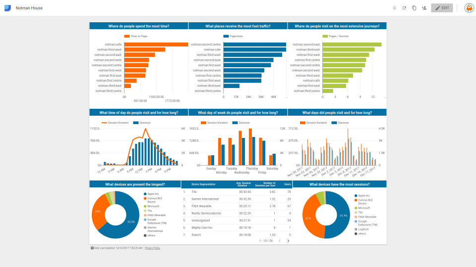
Below are commonly used charts and data visualisations which may serve as inspiration for the Report.
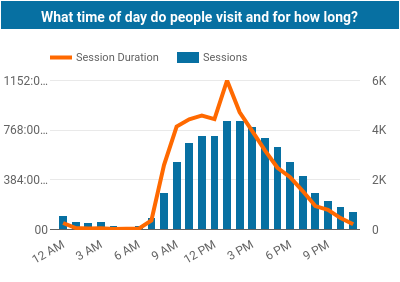
— What time of day do people visit and for how long?
| Dimension: | Hour |
|---|---|
| Metrics: | Session Duration Sessions |
| Sort: | Hour |
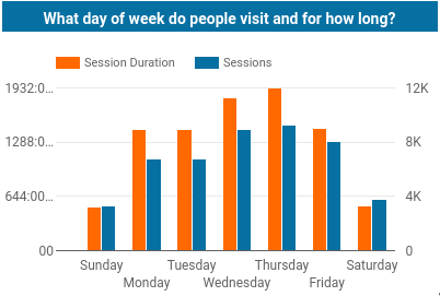
— What day of the week do people visit and for how long?
| Dimension: | Day of Week |
|---|---|
| Metrics: | Session Duration Sessions |
| Sort: | Day of Week |
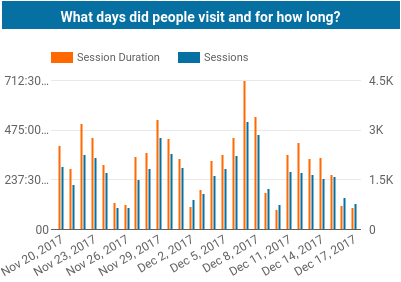
— What days did people visit and for how long?
| Dimension: | Date |
|---|---|
| Metrics: | Session Duration Sessions |
| Sort: | Date |
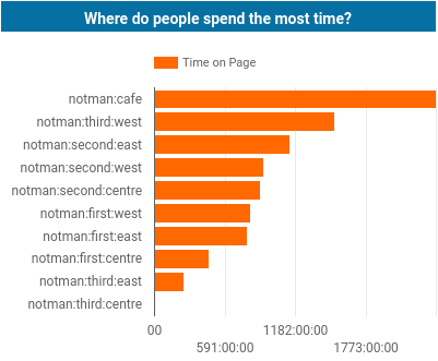
— Where do people spend the most time?
| Dimension: | Page Title |
|---|---|
| Metric: | Time on Page |
| Sort: | Time on Page |
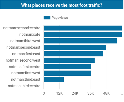
— What places receive the most foot traffic?
| Dimension: | Page Title |
|---|---|
| Metric: | Pageviews |
| Sort: | Pageviews |
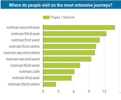
— What places do people visit on the most extensive journeys?
| Dimension: | Page Title |
|---|---|
| Metric: | Pages/Session |
| Sort: | Pages/Session |
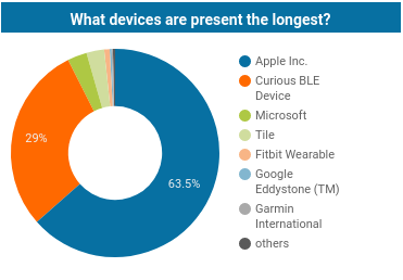
— What devices are present the longest?
| Dimension: | Device Segmentation |
|---|---|
| Metric: | Session Duration |
| Sort: | Session Duration |
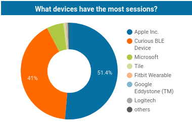
— What devices have the most sessions?
| Dimension: | Device Segmentation |
|---|---|
| Metric: | Sessions |
| Sort: | Sessions |
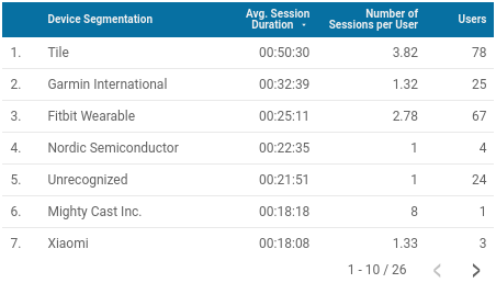
— How is the measured behaviour influenced by the type of device and its users?
| Dimension: | Device Segmentation |
|---|---|
| Metrics: | Avg. Session Duration Number of Sessions per User Users |
| Sort: | Avg. Session Duration |